
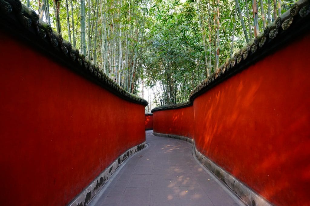
Red is the color of our blood, the color of lust and sexiness….its the color of our heart… seems like red is for our strong emotions… those that can drive us to great excitements or terrible fights.
The Impact of Red
| Mood & Emotions | Brain & Cognitive Effects | Mental Health & Well-Being | Physiological Effects |
| – Increases Excitement & Energy. – Stimulates Appetite. – Associated with Love & Desire. – Can Trigger Stress or Agitation. | – Enhances Attention to Detail. – Heightens Reaction Time. – Can Impair Complex Thinking. | – Can Increase Aggression & Irritability. – Boosts Physical Performance. – Influences Risk-Taking Behavior. | – Raises Heart Rate & Blood Pressure. – Triggers a Sense of Urgency. – Can Disrupt Sleep. |
Red is a bold, energetic, and warm color that can create a dramatic, cozy, or passionate atmosphere in a home. However, because it’s such a strong color, it should be used carefully to avoid overwhelming a space. Below, I’ll show different ways to incorporate red into home design, along with key principles for balance and harmony
- Red as an Accent Color (Best for Subtle Warmth & Energy)
Best For: Living rooms, dining areas, home offices
Why It Works: A pop of red adds vibrancy without overpowering the space.
How to Use It:
Accent Walls: A single red wall can make a space feel bold and inviting. Pair it with neutral or muted tones like gray, beige, or white to soften the intensity.
Furniture: A red sofa or armchair can serve as a stunning focal point. Keep the surrounding elements simple to let it shine.
Accessories: Throw pillows, curtains, rugs, or vases in red add warmth without commitment.
Artwork: A piece of red-based artwork can tie the color into the room without making it dominant.
Best Color Pairings:
Red + White → Clean, modern, and timeless
Red + Black & Gray → Sophisticated and dramatic
Red + Gold or Brass → Luxurious and warm
Red + Earthy Tones (Brown, Beige, Olive Green) → Cozy and grounded
- Deep, Dark Reds for Elegance & Coziness
Best For: Bedrooms, dining rooms, libraries
Why It Works: Deep reds (burgundy, wine, maroon) create a rich, intimate, and luxurious feel.
How to Use It:
Wall Paint: A deep red can make a space feel warm and intimate, perfect for a cozy bedroom or sophisticated dining room.
Upholstery: Velvet or leather furniture in deep red exudes elegance and warmth.
Lighting: Soft, warm lighting enhances the richness of dark red tones.
Wood & Metals: Dark reds pair beautifully with dark wood finishes (mahogany, walnut) and metallic accents like brass or gold.
Best Color Pairings:
Burgundy + Navy Blue → Moody and stylish
Wine Red + Gold/Brass → Classic and luxurious
Maroon + Charcoal Gray → Modern and elegant
- Bright Reds for a Modern & Energetic Look
Best For: Kitchens, dining rooms, playrooms
Why It Works: Bright red stimulates energy and appetite, making it great for lively spaces.
How to Use It:
Kitchen Cabinets or Backsplash: Red kitchens feel inviting and dynamic. Pair with stainless steel or black appliances for a sleek look.
Dining Chairs or Table: Red chairs add a modern pop while encouraging conversation and warmth.
Flooring & Rugs: A bold red rug can ground a neutral space and add personality.
Ceiling or Doors: A red front door or ceiling adds a unique statement.
Best Color Pairings:
Red + White & Black → High contrast and modern
Red + Stainless Steel → Sleek and contemporary
Red + Yellow or Orange → Playful and energetic
- Muted or Earthy Reds for a Soft & Natural Look
Best For: Bohemian, rustic, and minimalist interiors
Why It Works: Muted reds like terracotta, brick, or dusty rose feel warm and earthy rather than overpowering.
How to Use It:
Clay or Brick Walls: Adds natural warmth and texture.
Textiles: Use muted red in linen curtains, woven rugs, or throw blankets for a cozy feel.
Wood & Natural Materials: Red pairs well with wood, stone, and rattan for an organic aesthetic.
Soft Furnishings: A terracotta-colored couch or bedspread brings warmth to a neutral space.
Best Color Pairings:
Terracotta + Olive Green → Earthy and relaxing
Brick Red + Beige & Cream → Warm and neutral
Dusty Rose + Soft Grays → Modern and calming


Take Away
- Balance it Out – Red is intense, so pair it with neutrals (white, beige, gray) to prevent it from overwhelming the space.
- Use Different Shades & Textures – Mix deep reds, bright reds, and muted reds for a layered effect.
- Test Before Committing – Red looks different in various lighting conditions. Try samples before painting an entire wall.
- Consider Room Function – Use red in spaces where energy is desired (dining, kitchen, office), but avoid it in relaxation areas (unless using muted or deep reds).
- Go for Matte or Textured Finishes – Glossy red can feel too harsh; softer finishes (matte, velvet, distressed) create a more livable look.
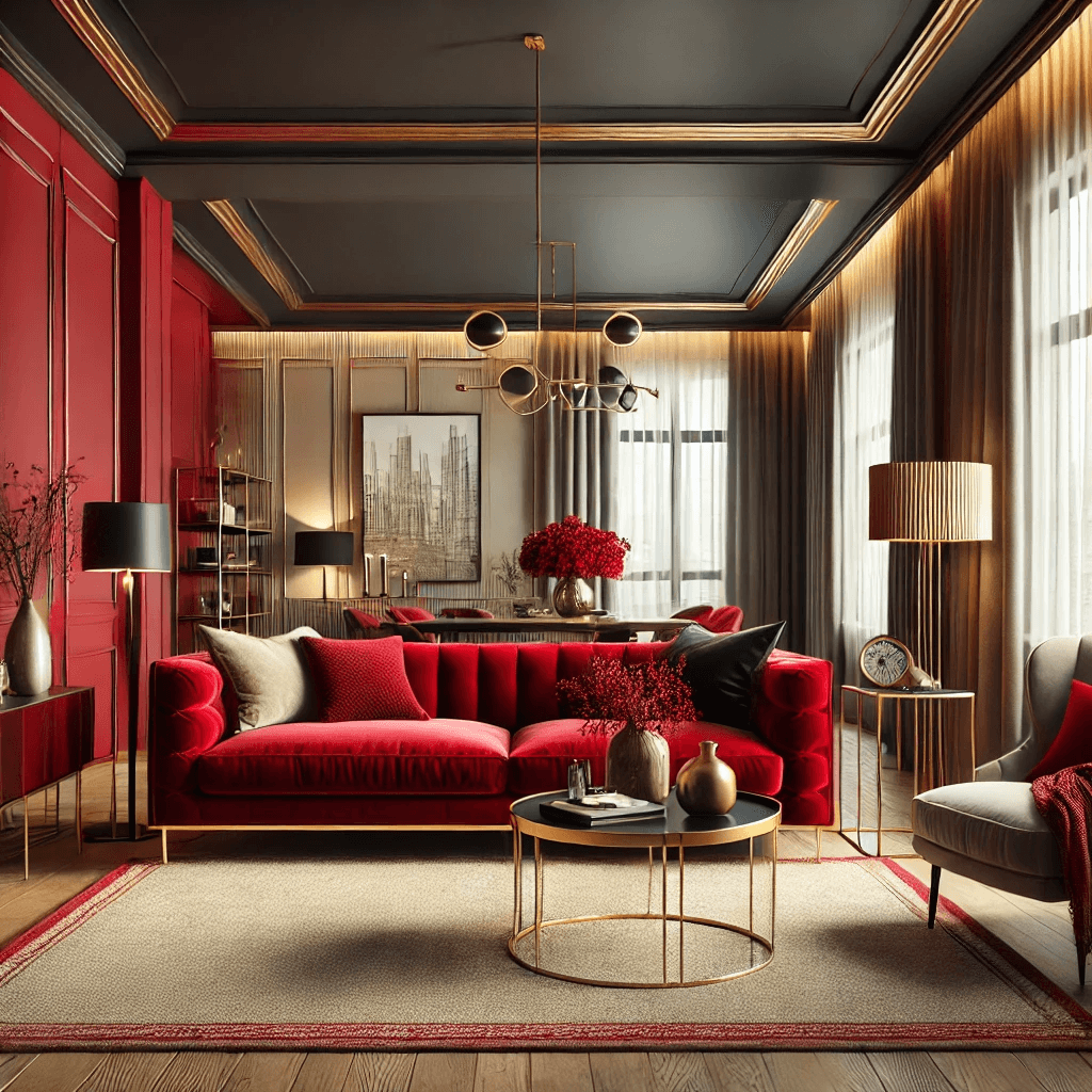
Here’s a modern living room featuring a sophisticated red color scheme! The deep red accent wall and velvet sofa create a bold yet elegant ambiance, balanced by neutral tones and warm lighting.
“Love like there’s no tomorrow. Live with no regrets, life’s too short. Find your smile and hold onto it.” – Madison Daniel
Nova ~ Design