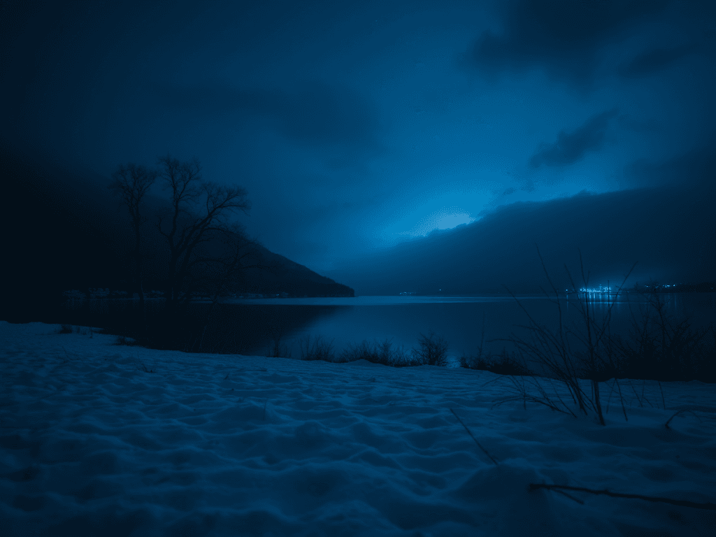
Blue is the freedom of the ocean, its a cool fall night or just peaceful relaxing place for some…
Did you know that researchers have found that the color blue has a significant impact on mood, brain activity, and mental state? lets dive into the deep water and see what it mean exactly.
| Mental Health & Well-Being | Mood & Emotions | Cultural & Psychological Associations |
| – Linked to Relaxation & Healing- soothing. – Environment Potential Anxiety-Reducing Effect. | – Calming & Stress-Reducing- lower heart rate and blood pressure. – Sadness or Melancholy. – Enhance creative thinking & Productivity | – Nature Connection- feelings of spaciousness, freedom, and peace. |
Blue is a versatile, calming, and sophisticated color that can create a range of moods depending on the shade and how it’s used. From serene and relaxing to bold and dramatic, blue works well in almost any room. Below, I’ll show different ways to incorporate blue into home design and explain how to balance it for the best effect.
- Blue as an Accent Color (Subtle, Stylish, and Timeless)
Best For: Living rooms, bedrooms, offices
Why It Works: Blue adds a sense of tranquility while keeping the space fresh and modern.
How to Use It:
Accent Walls: A deep blue feature wall adds depth and sophistication while keeping the rest of the space neutral.
Furniture: A navy or royal blue sofa adds richness without overwhelming the room.
Accessories: Throw pillows, curtains, and vases in shades of blue bring harmony and visual interest.
Artwork: Coastal or abstract blue art can tie the theme together effortlessly.
Best Color Pairings:
Blue + White → Crisp, clean, and coastal
Blue + Gray → Modern and sophisticated
Blue + Gold or Brass → Luxurious and elegant
Blue + Earthy Tones (Beige, Taupe, Wood) → Cozy and balanced
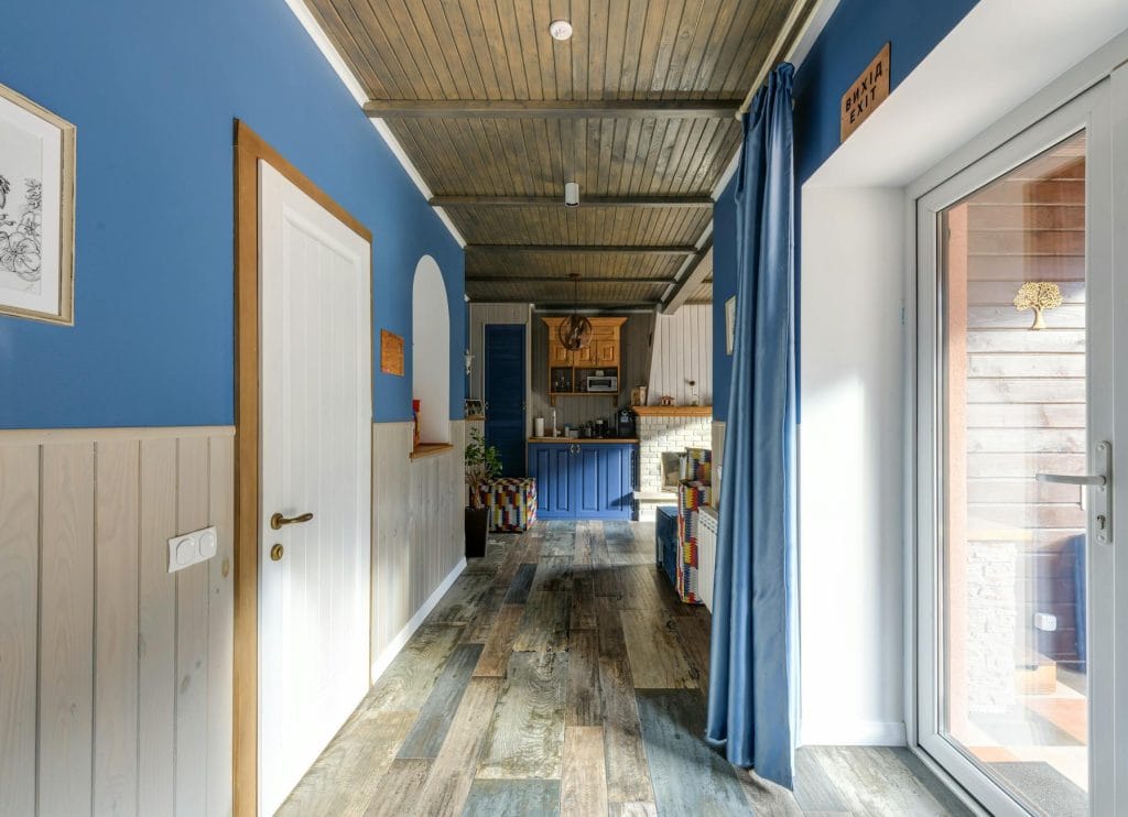
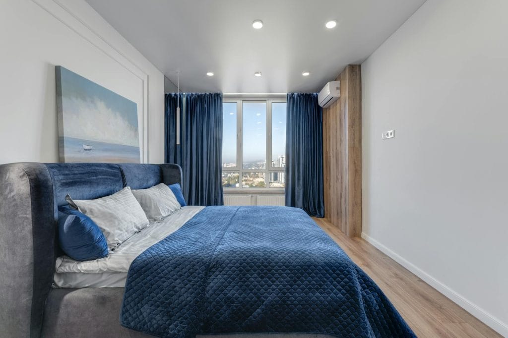
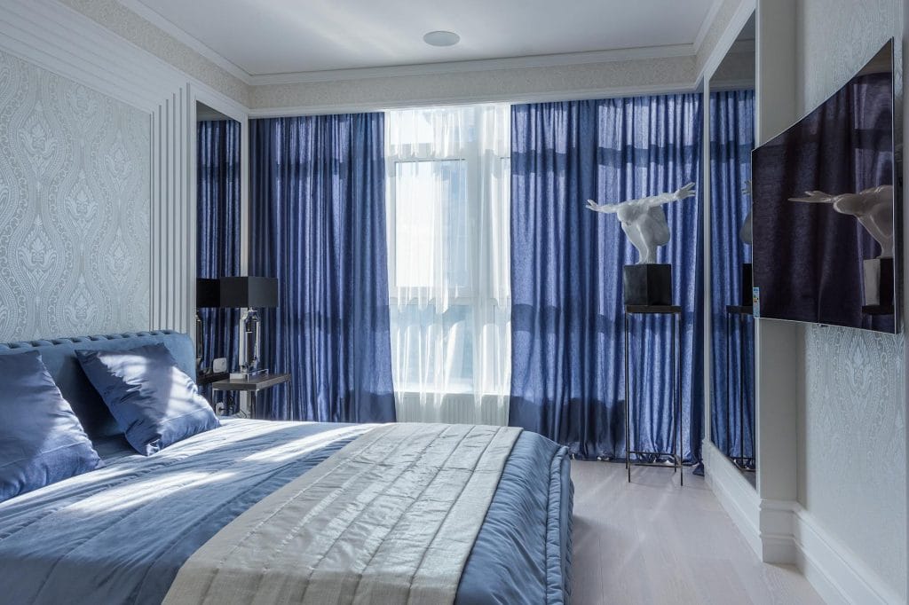
- Deep, Dark Blues for Elegance & Drama
Best For: Bedrooms, dining rooms, libraries
Why It Works: Dark blues (navy, indigo, midnight blue) create an intimate, elegant, and moody atmosphere.
How to Use It:
Wall Paint: A navy blue wall can make a space feel cozy yet refined.
Velvet & Leather: Upholstered furniture in deep blue looks luxurious and inviting.
Lighting: Warm lighting (gold sconces, chandeliers) contrasts beautifully with deep blues.
Dark Wood & Metals: Blue pairs beautifully with walnut, espresso wood, brass, or matte black finishes.
Best Color Pairings:
Navy Blue + Mustard Yellow → Warm contrast and stylish
Indigo + White & Silver → Cool and sophisticated
Dark Blue + Charcoal Gray → Moody and modern
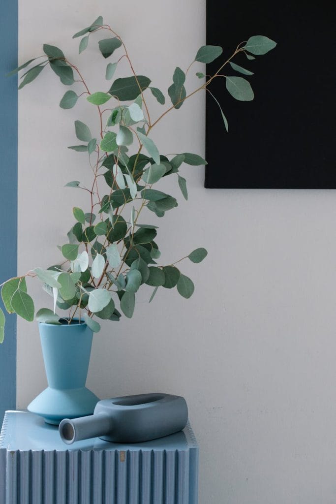
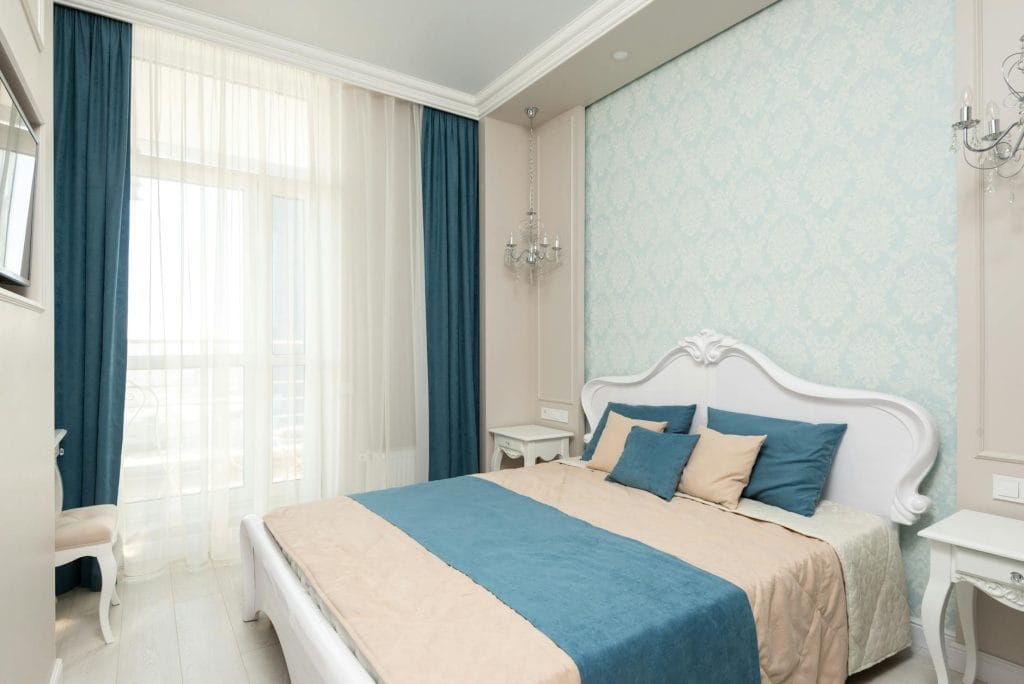
- Light Blues for a Fresh & Airy Look
Best For: Bathrooms, kitchens, nurseries, beach-inspired spaces
Why It Works: Light blues (sky blue, powder blue, pastel blue) create a calm and spacious feel.
How to Use It:
Wall Colors: Light blue walls make small rooms feel more open and airy.
Cabinetry & Tiles: A soft blue kitchen backsplash or vanity adds personality while keeping the space light.
Bedding & Curtains: Light blue textiles enhance relaxation in bedrooms.
Glass & White Accents: Pairing blue with glass decor, white furniture, or light wood keeps the space feeling breezy.
Best Color Pairings:
Sky Blue + White & Sand Tones → Coastal and refreshing
Pastel Blue + Soft Pink or Lavender → Playful and soft
Powder Blue + Light Wood → Scandinavian and minimalist
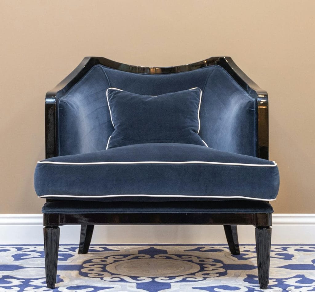
- Muted or Earthy Blues for a Natural & Cozy Vibe
Best For: Rustic, bohemian, or transitional styles
Why It Works: Muted blues like dusty blue, slate blue, or teal feel organic and sophisticated rather than overpowering.
How to Use It:
Soft Blue Walls: Works beautifully in living rooms and bedrooms for a timeless, elegant feel.
Textiles & Rugs: Woven throws, linen curtains, and Persian-style rugs in muted blues add texture and warmth.
Natural Materials: Blue pairs well with wood, stone, and leather for an earthy aesthetic.
Statement Furniture: A muted blue armchair or cabinet can add charm without overwhelming the space.
Best Color Pairings:
Slate Blue + Olive Green → Earthy and calming
Teal + Burnt Orange → Warm and eclectic
Dusty Blue + Cream & Taupe → Soft and elegant
Take Away
- Balance it Out – Blue can feel cold if overused, so add warm elements (wood, gold, beige) for contrast.
- Use Different Shades & Textures – Layering different shades of blue with various textures (velvet, linen, glass, wood) creates depth.
- Test Before Committing – Blue changes under different lighting, so sample before painting an entire wall.
- Consider Room Function – Use deep blues for cozy and elegant spaces and light blues for airy and fresh environments.
- Mix with Neutrals – Blue looks best when paired with neutrals like white, gray, beige, or taupe.
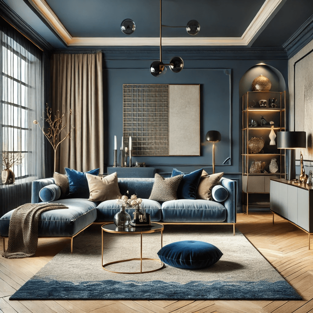
Here’s a modern living room with a sophisticated blue color scheme! The deep navy accent wall and velvet sofa create a luxurious yet calming atmosphere, balanced by neutral tones and warm lighting.
“Love like there’s no tomorrow. Live with no regrets, life’s too short. Find your smile and hold onto it.” – Madison Daniel
Nova ~ Design